Pieaugot Gemoss eksporta apjomiem, iepriekš radītā eksporta zīmola Just Nature dekoratīvi konservatīvais dizains saskārās ar grūtībām sacensties ar konkurenci globālajos plauktos.
Mūsu radītajā konceptā iemiesojām joku par veģetāriešiem, kuri galvenokārt ēd putnu barību. Šādi tapa gan sauklis "Bird food for humans", gan arī dizaina vēstījums.
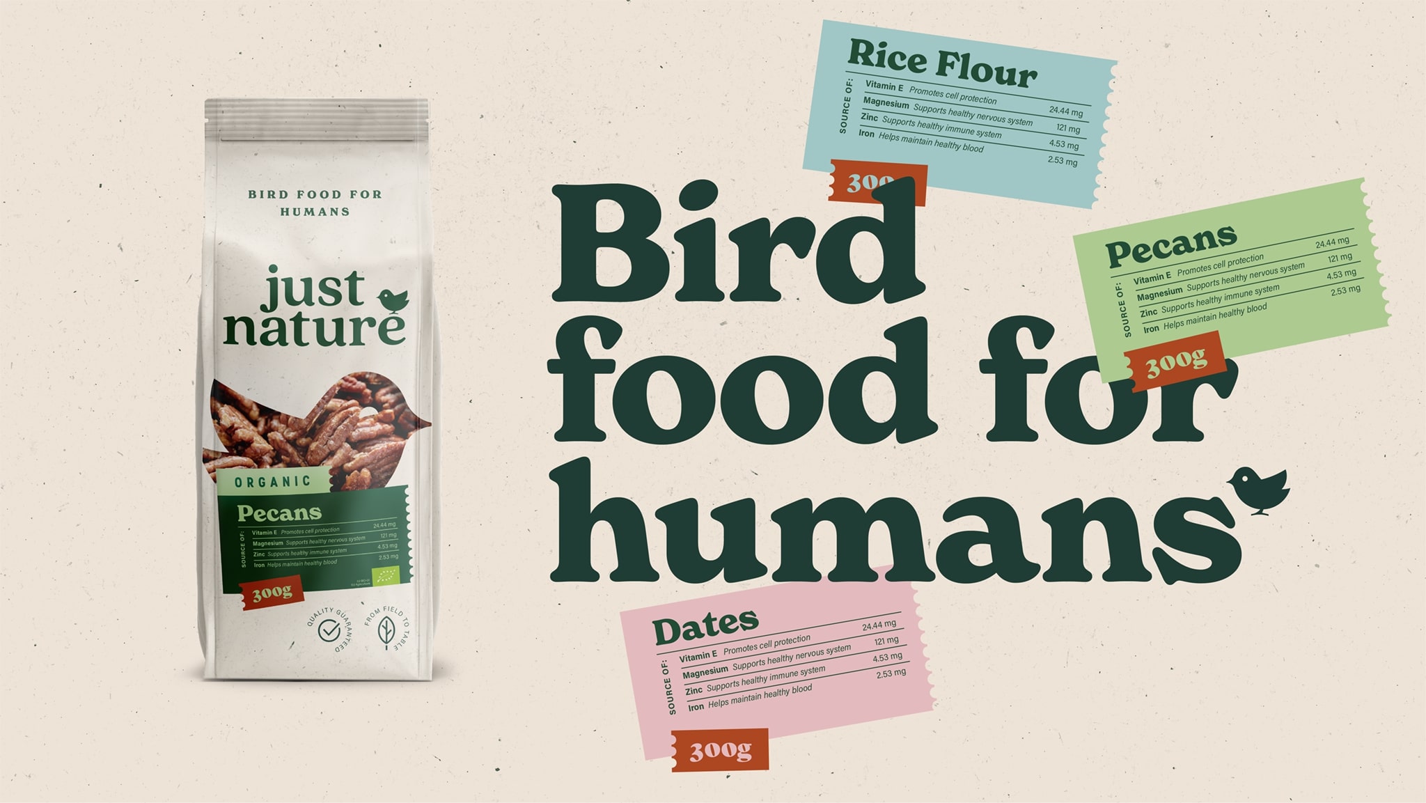
Lodziņš putna formā ļauj pašam produktam ar savu tekstūru un krāsu informēt patērētāju, vienlaikus izslēdzot vajadzību pēc atsevišķa garšas attēlojuma. Spilgto toņu produktu nosaukumu uzlīmes palīdz atšķirt dažādos produktus, kā arī dod iespēju uzskatāmi iepazīties ar pašu svarīgāko — uztura vērtībām. Uzlīmju pastmarkas tipa forma vēsta par Just Nature produktu plašo izcelsmes areālu un to šķietami paviršais uzlīmēšanas stils lauž sterilu perfekcionismu, liecinot par cilvēka klātbūtni Just Nature “putnu barības” apritē.
As Gemoss's export volumes grew, the previously created brand "Just Nature" with its decoratively conservative design encountered difficulties in competing on global shelves.
In our design solution, we embodied an old joke about vegetarians who mainly eat bird food. This resulted in both a slogan "Bird food for humans" and a design essence.
The see-through window in the bird's form allows the product itself, with its texture and color, to address the consumer while eliminating the need for a separate depiction of taste. The bright-toned product name labels help to differentiate between various products as well as provide an opportunity to clearly understand the most important aspect — nutritional values. The label's postage stamp-like shape indicates the wide geographical origin of Just Nature products and their seemingly casual labeling style breaks the sterile perfectionism, representing the human presence in the circulation of Just Nature's "bird food."